farsiight helped WYN drive sustainable new customer acquisition and revenue growth across two key markets.Hello

Strike Gently Co

Building a repeatable content system for a U.S. apparel brand

Background

Strike Gently Co. had a strong visual identity and a loyal niche audience, but content
direction was inconsistent. Growth depended heavily on occasional high-performing
posts rather than a system the team could repeat every month.

The challenge

Our approach

We built a practical content strategy focused on clarity and sustainability.

The performance

After implementing a structured content plan, the brand experienced:

Rather than chasing trends, the focus shifted to steady, predictable growth.

Before this, we were mostly posting on instinct.
The strategy gave us clarity. We finally knew what content to focus on and how to plan ahead without overthinking every post.”
“Planning content became much easier. We stopped guessing and started repeating what actually worked.”

NOODLES & COMPANY

MANAGER OF SOCIAL & DIGITAL MARKETING

Forbes Functions

Bringing clarity and growth to a U.S. event services brand

Background

Forbes Functions is a U.S.-based event planning business offering premium, curated
experiences. While their work quality was high, their content did not clearly
communicate value or guide potential clients toward inquiry.

The challenge

Our approach

We shifted the content focus from visuals alone to value-driven storytelling.

The performance

Following the strategy rollout, the brand saw:

Content started supporting the business, not just filling the feed.

“We had good visuals, but no direction.
This helped us understand what to post and why. Everything started feeling more intentional.”
“The biggest difference was clarity. Content stopped feeling random and started supporting real business goals.”

NOODLES & COMPANY

MANAGER OF SOCIAL & DIGITAL MARKETING

Beam

Bringing clarity and growth to a U.S. event services brand

The situation

Beam already had good products and a clear brand voice.
What was missing was content that felt easy, both to create and to
consume.

Some videos felt too polished.
Others felt unscripted but unclear.
There wasn’t one consistent direction tying everything together.

What we focused on

Scripts
Instead of “reading lines,” we wrote loose talking points.
Short. Conversational. Something a founder could actually say without sounding rehearsed.

Founder content
We structured videos around:

The goal wasn’t authority.
It was familiarity.

Product videos

We kept things simple:

The product didn’t need to be explained twice.

UGC-style content
Phone-shot, first-person, casual delivery.
Content that blended into the feed instead of stopping it with polish.

Production setup
Everything was shot remotely using clear direction and references.
No heavy crews. No complicated setups.

How it performed

Once the new content direction was in place:

Nothing dramatic.
Just steady improvement and fewer misses.

“This felt more like us.
We weren’t trying to sound impressive, just clear.”
“Recording stopped feeling stressful.
We knew what to say and when to stop.”

NOODLES & COMPANY

MANAGER OF SOCIAL & DIGITAL MARKETING

Native Pet

Bringing clarity and growth to a U.S. event services brand

The situation

Native Pet’s audience cared about trust more than polish.
People wanted to understand the product quickly and see how it fit into real
life.

Highly produced ads weren’t helping.
They felt distant.

What we focused on

Scripts
Simple structure:

No big claims.
Just everyday language.

Product videos

We showed:

Nothing staged.

UGC-style content
Creators were guided, not controlled.
We focused on tone and message, not perfect delivery.

Remote workflow

All content was created remotely with:

This kept output steady without slowing anyone down.

How it performed

After switching to this approach:

The content didn’t shout.
It explained.

“It stopped feeling like advertising.
It felt closer to how customers actually talk.”
“Remote shoots saved time, but the content still felt intentional.”

NOODLES & COMPANY

MANAGER OF SOCIAL & DIGITAL MARKETING

Forward Dental

Bringing clarity and growth to a U.S. event services brand

Background

Forward Dental relied on Meta Ads as a primary channel for appointment inquiries. While leads were coming in, performance fluctuated significantly from week to week, making it difficult to forecast demand or scale with confidence.

The ad account had grown over time without a clear structure, which limited
visibility into what was driving results.

The Challenge

Strategy & Execution

Account restructuring
Campaigns were consolidated and reorganized around clear objectives. Testing and scaling were separated to ensure results could be evaluated accurately.

Creative testing framework
We introduced controlled creative testing, isolating variables such as:

Funnel optimization

Traffic was directed to focused service pages with:

Outcome

Within the first 60–90 days:

Paid acquisition shifted from reactive management to a predictable, operationally reliable system.

“Once the structure was cleaned up, everything became easier to understand.”
“Consistency mattered more than spikes, and this finally delivered that.”

NOODLES & COMPANY

MANAGER OF SOCIAL & DIGITAL MARKETING

Teamflow

Background

Teamflow had consistent search demand, but Google Ads performance lacked efficiency.
Spend was spread across broad keywords that attracted interest but did not consistently convert into qualified trial users.

The Challenge

Strategy & Execution

Keyword intent mapping
Campaigns were rebuilt around search intent:

Ad copy refinement
Ads were rewritten to closely reflect user search language and qualify clicks upfront, reducing unproductive traffic.


Landing page alignment
Traffic was routed to pages that directly addressed the query context, minimizing friction and clarifying next steps.

Outcome

After restructuring:

Google Ads became a reliable demand-capture channel rather than an experimental cost center.

“The conversations changed. People already understood what we did.”
“Search finally felt predictable instead of uncertain.”

NOODLES & COMPANY

MANAGER OF SOCIAL & DIGITAL MARKETING

Kinship

Background

Kinship wanted to explore TikTok Ads without relying on trends or overproduced creative.

The priority was learning what content formats actually resonated with
TikTok audiences while maintaining brand integrity.

The Challenge

Strategy & Execution

Creative-first testing
TikTok was treated as a creative platform first. Testing focused on:

Simplified funnel
Traffic was sent to fast-loading product pages with minimal copy, ensuring clarity without friction.


Iterative optimization
Winning creatives were refined incrementally rather than replaced, allowing learnings to compound over time.

Outcome

Across multiple testing cycles:

The brand gained clarity on what consistently worked on the platform.

“Once we stopped forcing polished ads, performance became clearer.”
“The testing process helped us learn quickly without overspending.”

NOODLES & COMPANY

MANAGER OF SOCIAL & DIGITAL MARKETING

Luminary Bakery

Background

Luminary Bakery had a strong brand story and visuals, but organic traffic was
not translating into store visits or inquiries. Pages were written more for
storytelling than search intent.

The Challenge

SEO Work

Keyword strategy
We mapped keywords by intent:

Each page was assigned a single primary intent to avoid overlap.

On-page SEO

Pages were restructured to improve:

Performance

Within 4 months:

At first we worried SEO would change how our brand sounds. It didn’t. It just made things clearer.
People coming in through search now seem to be looking for exactly what
we offer.

NOODLES & COMPANY

MANAGER OF SOCIAL & DIGITAL MARKETING

Blueland

Background

Blueland had strong branded traffic but struggled to rank for competitive
non-branded keywords. Competitors with stronger backlink profiles
consistently outranked them.

The Challenge

SEO Work

Keyword selection
We focused on discovery keywords related to:

On-page SEO

Authority was built through:

No bulk links. No automation.

Performance

Over 6 months:

The biggest shift wasn’t traffic volume, it was visibility. We started appearing for searches we had never shown up for before, and over time that presence began to stack.

NOODLES & COMPANY

MANAGER OF SOCIAL & DIGITAL MARKETING

Notionway

Background

Notionway published strong content, but organic growth had plateaued.
Rankings fluctuated, and new pages took too long to index or perform.

The Challenge

SEO Work

Technical audit
We reviewed:

Implementation

Work included:

No bulk links. No automation.

Performance

Within 90 days:

We already had content, so it was frustrating not seeing results. Once the technical issues were fixed, things started moving. New pages showed up faster and rankings felt more stable.

NOODLES & COMPANY

MANAGER OF SOCIAL & DIGITAL MARKETING

HarborFit

Background

HarborFit relied almost entirely on paid ads. SEO had never been
implemented in a structured way, and organic visibility was minimal.

The Challenge

SEO Work

Keyword strategy
We created a full keyword map covering:

On-page & technical SEO

Pages were optimized for:

Performance

Within 6–7 months:

SEO wasn’t something we had prioritized before.
A few months in, organic leads became consistent enough that we started planning around them instead of treating them as a bonus.

NOODLES & COMPANY

MANAGER OF SOCIAL & DIGITAL MARKETING

Amazon

Diamond Foods

The Challenge

Premium nuts competing in the snack aisle noise. Diamond of California needed to own the “gourmet healthy snack” positioning on Amazon, but traditional product photography was too slow and expensive to test multiple lifestyle angles. The real constraint: create high-converting visual narratives at the speed of e-commerce, without sacrificing the brand’s artisanal premium feel.

The Execution

We didn’t just run ads, we engineered a visual production pipeline that outpaced traditional photography.

Generative AI Imagery at Scale

Built a proprietary AI imaging workflow to generate contextual lifestyle visuals (walnuts cascading over Himalayan pink salt crystals, dark chocolate shards in moody lighting) that matched Diamond’s premium aesthetic. These weren’t generic stock composites—they were brand-trained generative models that maintained consistent lighting, shadow behavior, and texture fidelity across hundreds of variant ads.

Motion-First Creative Strategy

Designed animated ad units specifically for Amazon’s ecosystem: • Sponsored Brand Video: 6-second loopable motion graphics highlighting texture contrast (crunch visualization through particle sims) • DSP Display Motion: Subtle parallax product rotations for retargeting banners that reduced banner blindness • A+ Content Modules: Cinematic short-form video loops for product detail pages, optimized for mobile autoplay silence

Automation Meets Artistry

Integrated Amazon Ads API with creative versioning engines. Instead of static A/B tests, we deployed dynamic creative optimization—where motion graphic templates auto-populated with AI-generated hero images based on real-time performance data, creating a self-evolving visual funnel.

Key Visuals

The Crystal Pour:

AI-generated macro shot of salt crystals framing walnut halves (used in 47% higher CTR variant)

The Dark Chocolate Dip:

Generative composite of salted dark chocolate walnuts with cinematic depth of field

The Loop:

Seamless motion graphic of product rotation optimized for 6-second Amazon video specs

The Dashboard:

Real-time creative performance metrics visualized through dynamic data graphics

Toolkit

Adobe Premier Pro,

Adobe After Effects

DaVinci Resolve

Bank Of America

Bank of America (Commercial Banking)

The Challenge

ommercial banking runs on precision, but it’s often buried in legacy complexity. The CashPro® check deposit feature needed to feel less like enterprise software and more like a competitive advantage, shifting the narrative from “manual paperwork” to “100,000 checks processed with a tap.” The visual hurdle: making backend banking infrastructure feel immediate, mobile, and remarkably simple without losing the institutional trust that BofA commands.

The Execution

We architected a visual language that treats financial efficiency as a design feature.

UI Choreography

Designed a seamless motion system connecting physical hardware (high-volume blue scanners) with digital interfaces. Rather than static screen recordings, we created cinematic UI animations, camera movements that glide through the CashPro® interface, highlighting touch targets with purposeful magnification and fluid state transitions. The “Capture → Add Info → Submit” flow became a rhythmic three-act structure, with each step marked by satisfying micro-interactions that telegraph speed and security.

Split-Screen Synchronization

Utilized dynamic split-screen compositions to collapse time and space, showing mobile deposits and scanner workflows simultaneously without visual confusion. The divide wasn't just functional; it was graphic, using Bank of America’s signature red as a visual anchor that bridges both workflows, reinforcing platform unity.

Data Visualization as Motion Graphics

Transformed abstract capacity metrics (“100,000 checks monthly”) into tangible visual weight. Animated infographics using circular radial wipes and kinetic typography that count up with momentum, making enterprise scale feel visceral rather than statistical.

The Human Interface

Intercut clean UI motion with lifestyle footage graded in cool, professional tones—business owners interacting with tablets in natural light. The contrast between warm human moments and sleek digital precision created a trust matrix: technology serves people, not the other way around.

Key Visuals

The Scanner Blue:

Cinematic product shots of the high-volume scanner with animated light bars indicating processing speed

The Flow State:

Continuous take animation moving from mobile capture to desktop confirmation, showing ecosystem connectivity

The Capacity Counter:

Motion graphics animation of "100,000" deconstructing into individual check icons, then reassembling into a growth chart

The Split:

Perfectly synchronized dual-screen composition showing parallel deposit methods with matched motion timing

Toolkit

After Effects (UI animation, motion graphics)

Premiere Pro (Picture editing, sound design)

Illustrator (Vector iconography, scanner illustrations)

McDonalds

McDonalds

The Challenge

A feature-rich app means nothing if the redemption moment feels like homework. McDonald’s needed to collapse the gap between “download” and “enjoy,” teaching users to navigate QR code redemption across three distinct physical touchpoints (kiosks, counters, drive-thrus) without creating three separate videos. The constraint: 90 seconds to eliminate anxiety about the 3-minute redemption window, ensuring users felt empowered rather than pressured.

The Execution

We designed a modular motion ecosystem where vector-based brand worlds adapt seamlessly
from vertical social feeds to horizontal in-store displays.

Character-Driven UX Choreography

Created a cast of streamlined 2D characters that serve as audience surrogates — moving through stylized McDonald’s environments with rubber-hose animation energy that nods to brand heritage while maintaining modern UI clarity. These characters don’t just use the app; they embody the speed of the experience, transitioning from confused to delighted in synchronized beats with the interface animations.

The Interface as Character

Treated the mobile UI as a primary animation subject rather than an overlay. Screens slide in with elastic easing, QR codes expand with satisfying haptic-style bounces, and the critical 90-second countdown timer pulses with chromatic intensity (brand red shifting to urgency orange)—turning time pressure into visual excitement rather than stress.

Omnichannel Visual Logic

Engineered split-screen compositions that behave like triptychs: kiosk, counter, and drive-thru scenarios share the frame simultaneously, unified by Golden Arches color blocking. The animation timing is synchronized across all three channels, allowing the single master edit to work as:

Vertical social: Focused on mobile UI with cropped character vignettes

Horizontal in-store: Full triptych view for queue-line displays

Square displays: Centered compositions for kiosk-endcap screens

Sonic Brand Integration

Designed audio-reactive motion graphics where the satisfying “ding” of successful redemption triggers starburst animations and checkmark flourishes—creating Pavlovian positive reinforcement around the brand’s app experience.

Key Visuals

The Triptych:

Three-panel split-screen showing parallel redemption paths, unified by continuous background vectors that flow across the divide

The QR Bloom:

Explosive radial animation of the QR code scanning moment, with particle effects mimicking digital confetti

The Timer Pulse:

Kinetic typography counting down the 3-minute window with increasing visual momentum (scale + color shifts)

Character Arc:

Transformation sequence showing a user moving from "app hesitant" to "deal redeemed" through fluid morphing transitions

Toolkit

After Effects (character rigging, UI animation)

Illustrator (vector asset creation), Adobe Premier Pro

DaVinchi Resolve

Coca Cola

Coca Cola

The Challenge

Coke Zero lives in the dark, literally. The brief demanded a sensory-heavy reveal that communicated “ice-cold boldness” while battling the visual flatness of a black can against black. We needed to make viewers feel the chill before they even tasted it, transforming a simple product shot into a thirst-inducing cinematic moment.

The Execution

Instead of fighting the darkness, we weaponized it. High-contrast rim lighting carved the can out of negative space, letting specular highlights do the storytelling, every bead of condensation became a reflective landmark.

The hero moment came through fluid dynamics: a custom-engineered splash simulation built in X-Particles that matched Coke Zero’s specific viscosity and carbonation behavior. Not generic water—this liquid had bite. We paired macro-photographic texturing (brushed aluminum pull-tabs, label micro-fiber) with slow-motion liquid choreography that built tension, releasing into a rapid-fire logo animation that hit like the first sip.

Key Visuals

The Silhouette:

Edge-lighting techniques that turned the can into a sculptural object

The Splash:

Procedural fluid simulation with 8-million particle count

The Sweat:

Custom condensation shaders reacting to virtual temperature differentials

The Reveal:

Kinetic typography syncopated with audio-reactive motion

Toolkit

After Effects

Nike

Nike

The Challenge

The Air Max 97 is a heritage icon—bullet-train inspired lines from 1997 that could easily feel archival rather than urgent. The brief demanded a visual language that respects the silhouette’s history while hijacking Gen-Z’s attention spans: make visible air technology feel like sci-fi hardware, not sportswear specs. All in fifteen seconds, vertical format, thumb-stopping.

The Execution

We treated the shoe as architecture in motion, deconstructing its layers to reveal the machinery of style.

Procedural Deconstruction

Engineered a 3D rig where the Air Max 97’s upper and sole unit violently separate along the weld lines, suspend in zero gravity, then magnetically snap back with ballistic force. This wasn’t just a exploded-view diagram; it was kinetic sculpture showing how the layers work while creating ASMR-level satisfaction. The metallic silver upper was shaded with anisotropic reflections that catch light like liquid mercury during the separation.

Viscous Transitions

Designed custom liquid simulation streams in teal and Safety Orange that flow along the shoe’s signature wave lines, not water, but something denser and more alien, suggesting compressed air made visible. These fluids collide with glitch artifacts (datamoshed frame blending) that bridge cuts, making the shoe appear to phase in and out of digital existence.

Beat-Matched Violence

The edit is locked to a trap-influenced soundtrack where every kick drum triggers a visual impact: the shoe rotates 90 degrees on the snare, glitch spikes on the hi-hat, typography explodes on the drop. The pacing respects the 15-second constraint by treating it as a limitation of physics, maximum information density with zero fat.

Attitude Typography

"KISS MY AIRS" doesn’t just appear; it assaults the frame. Custom kinetic type treatment with chromatic aberration and scan-line distortion that mirrors the shoe’s glitch aesthetic. The text interacts with the 3D space, letters pass behind the shoe’s heel tab, grounding the graphic in the product’s reality.

Key Visuals

The Autopsy:

The separation moment where sole and upper hang suspended, visible air unit glowing from within

The Mercury Flow:

Teal and orange liquid streams navigating the 97’s valleys and ridges like racing stripes made of water.

The Rim Fire:

Extreme close-ups with harsh rim lighting that turns the metallic upper into a mirror of its environment

The Drop:

Typography collision on frame 12, where "KISS MY AIRS" impacts with 3D camera shake and sub-bass visual distortion.

Toolkit

After Effects (glitch compositing, typography animation, beat-sync editing)

Hyundai

Hyundai Motorsport / Hyundai N Performance

The Challenge

Hyundai built its empire on reliability warranties, not podium finishes. The N Line launch needed to violently reframe that perception—transferring Motorsport credibility (TCR championship DNA) to dealership floors without alienating the daily driver. The core tension: how do you make a front-wheel-drive sedan feel like a race car without lying? The answer had to live in the edit, in the sensory bridge between professional violence and consumer accessibility.

The Execution

We architected a transfer-of-power narrative, using Gabriele Tarquini not as a spokesman, but as a medium.

The Possession Edit

Cutting protocol: zero static shots in the first 30 seconds. The film opens with Tarquini’s eyes in extreme close-up—reflected track lines in the iris—then explodes into staccato montage: piston firing sequences, tire smoke blooming at 120fps, gear shifts treated as percussion instruments. The pace creates somatic anxiety; viewers don’t watch the speed, they feel it through temporal compression.

Sonic Transference

Sound design as storytelling engine: we isolated the TCR car’s raw intake roar and wove it into the Elantra N’s idle sequence. As Tarquini blips the throttle in the race car, the cut lands on the production vehicle’s exhaust note—suggesting the spirit has migrated. No voiceover needed; the engine harmonics do the translation.

The Garage as Birth Canal

The reveal sequence was choreographed like a horror film jump-scare in reverse. The garage door lifts in slow motion (anamorphic flare blooming across the lens), revealing the camouflage-wrapped Elantra N backlit by sodium vapor. The camera doesn’t race to the car; it creeps, building dread and desire simultaneously. The camouflage wrap pulses with projected racing stripes—digital ghost of the TCR livery bleeding onto the production body.

Tactile Macro-Cinema

Intercutting the velocity with extreme mechanical intimacy: sweat on Tarquini’s knuckles, carbon fiber weave under fingernail lighting, the specific click-pattern of the sequential gearbox. These haptic details ground the fantasy in motorsport reality.

Key Visuals

The Iris Reflection:

100mm macro of Tarquini’s eye with mirrored track geometry, transitioning to POV windshield view via match-cut

The Drift Geometry:

i30 N TCR mid-corner, tire smoke forming perfect aerodynamic vectors behind the rear wing

The Shift Percussion:

Rapid-fire editing between Tarquini’s heel-toe technique and the Elantra N’s metal pedals—rhythmic cutting that suggests shared DNA

The Birth:

Garage door lifting to reveal Elantra N, camouflage wrap catching light like wet asphalt, first engine start shattering the silence

Toolkit

Premiere Pro (assembly, rhythm editing)

DaVinci Resolve (color grading, track matte extraction)

Kim Klacik for Congress

Kim Klacik Congressional Campaign

The Challenge

Political ads thrive on either nostalgia or outrage—rarely both. This campaign needed to visually reconcile Baltimore’s industrial past with its distressed present, while proposing a future tense. The constraint: establish immediate credibility for a fresh candidate in 30 seconds, navigate sensitive urban imagery without exploiting it, and make municipal finance ($20B accountability) visually urgent rather than abstract.


The Execution

We designed a visual argument that functions as a proof-of-concept, not just a complaint.

Direct-to-Camera Authenticity

The edit prioritizes Klacik’s direct address as the narrative spine—cutting between her unflinching close-ups and environmental B-roll to create a personal indictment. The pacing here is conversational but relentless: no pauses longer than 0.8 seconds, creating a sense of breathless urgency that mirrors the campaign’s "time is running out" messaging.

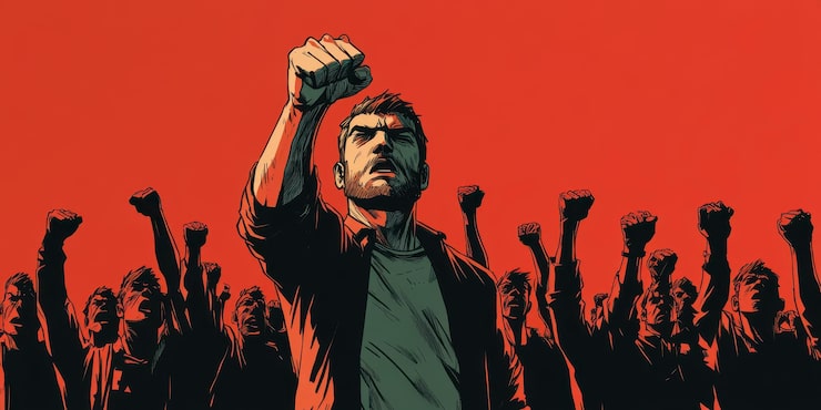
Juxtaposition as Rhetoric

Color theory meets political symbolism: the edit aggressively contrasts the candidate’s saturated crimson against desaturated urban decay—grayscale concrete, rusted steel, boarded row houses. This isn’t subtle grading; it’s visual algebra: vibrancy = change, decay = status quo. The red becomes a beacon in the wreckage, edited to appear during verbs of action ("revive," "reinvest") and vanish during moments of critique.

Data Visualization with Teeth

Motion graphics transform bureaucratic outrage into visual stakes. The "$20 Billion Missing" sequence uses animated question marks burned into aerial satellite footage—not as decoration, but as accusation. Typography is bold, sans-serif, with a slight chromatic aberration suggesting corruption/instability. The future-port visualization employs subtle parallax and volumetric lighting to make infrastructure feel tangible rather than promissory.

The Three-Beat Structure

The edit is syncopated to a three-act rhythm (Revive/Reinvest/Reclaim), each marked by distinct visual language:

Sonic Urgency

Sound design bridges the cuts: industrial ambient (distant foghorns, chain-link fences rattling) colliding with percussive hits on each motion graphic reveal, creating a soundtrack of friction and momentum.

Key Visuals

The Beacon:

Medium shot of Klacik in crimson against a collapsed warehouse wall, color-graded so the red pops 40% above the luminance of the background

The Ghost Money:

Aerial Baltimore footage with procedural question mark animations tracking across federal buildings—suggesting hidden paths/corruption

The Future Dock:

3D visualization of revitalized port with container ships moving in fast-forward, suggesting inevitable progress if the blueprint is followed

The Mechanism:

Macro shot of voting machine lever pull, cross-dissolved with the port crane hook rising—equating civic action with industrial construction

Toolkit

Premiere Pro (parallel action editing, pacing modulation)

After Effects (kinetic typography, tracking graphics, CGI compositing)

DaVinci Resolve (selective color isolation for the red dress treatment, contrast expansion)

Post Production